FitIn


Role
I was responsible for the experience strategy, visual design, and interaction for FitIn. The project brief with specific guidelines and user research were provided.
These guided my design decisions.
Timeline
March 2022
Challenges
According to the project brief, the app needed to incorporate 3 key attributes:
EASY
INFORMATIVE
FUN
Meet Rebecca
Based on the provided research, I created a visual representation of the user persona. Personifying Rebecca helped me design FitIn with her needs and goals in mind.

Goals & Needs
● Rebecca wants to lose weight and get in shape, as her sedentary job doesn’t allow
a lot of time for exercising.
● To help with this goal, Rebecca wants to find a tool that will help her fit exercise
routines into her busy schedule.
● As a beginner to working out, Rebecca also wants something that will help her learn how to properly exercise.
● Rebecca wants help finding routines she can enjoy.
Tasks
● Rebecca wants to be able to find exercises that match her goals of losing weight and getting in shape.
● In addition, she wants to find short exercises that she can do multiple times per day in between other activities.
● She wants the tool to keep her motivated as well, as her schedule can often be distracting.
Environment
● Physical: Rebecca lives in an apartment with her boyfriend and 3-year old daughter.
● Social: She has several friends from her software development job, and one of them recommended this tool as something she should check out to help her reach her goals.
● Technological: Rebecca is very tech savvy, as she works on computers every day.
User Flow
Rebecca needed to navigate FitIn to achieve her goals somehow.
I thought it through and simplified the flow.

Sketches
Applying a mobile first approach, I translated Rebecca’s user flow into these sketches:

Mid-Fidelity Wireframes
The design was scaled up fast due to time limitations.

In the Mood
Two unique mood boards were crafted. One was lighter in color and attitude.
The other was darker. I ended up going with the darker scheme, but later incorporated the light blue. The mood reflected Routine, Health, and Fun.

“A little progress each day adds up to big results.”
Style Guide
To create successful user experiences, consistency is key. Concepts from the mood board evolved into our Style Guide here. This ensured that all components of the user interface matched the user experience design decisions.

Animation

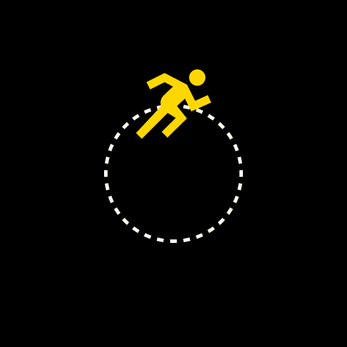
The Schedule Exercise Loading Screen provided an opportunity to craft a simple GIF. It was enjoyable to learn and build, adds some flair, and decreases wait time for the user.
Final Designs

Retrospective
Building FitIn was a challenging and rewarding experience. Creating a product that could potentially improve someone’s life is quite an opportunity. Overall, I’m satisfied with the final product. But there’s always room for improvement.
UX-speaking, even though it wasn’t suggested, I would have done a competitive analysis early on. This would have provided market knowledge and inspiration for essential app layout and features (e.g., scheduling recurring exercises). I also would have tried a round of A/B Testing on the exercise descriptions to see if the copy is “fun,” as Fun is one of the app’s three key words. (What makes copy “fun”?) A simple Usability Test with the final product would be great as well, so that we can learn what works, what doesn’t, and if FitIn accomplishes its mission.
UX/UI Designers should always design with the user in mind. I must admit that I didn’t always work with Rebecca’s needs and goals in view. Crafting FitIn gifted me a few things: UI fundamentals, the lesson to stay focused on the user, and the realization that we should validate UI designs with UX testing practices.
Thank you!
Fred Tan
UX/UI Designer
fred.e.tan@gmail.com